In our 2nd lesson after filming, we were missing two group members so we had to slightly change our plan for the lesson - Ellie and I experimented with the LiveType software and managed to discover various fonts that we could use for the titles, the production company logo and the film title. We settled on the production company being named "Inertia Productions" as it sounds very mysterious and perhaps threatening. These are the different styles we shortlisted:
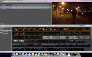 |
| A screen shot to show all of the footage on iMovie before editing |
We also went through all of the footage to review it, deleting unneccesary or bad takes on the iMovie software. We then experimented with Final Cut to see if we could rectify specific areas to prevent a re-shoot, which would be difficult considering Jacob (The Detective) had a hair cut a few days after we finished filming. We used some basic filters and effects such as Brightness and Contrast controls and discovered we could change these clips to make them more suitable, or not include them, as we had plenty of footage to work with.
When the rest of the group returned, we discussed the fonts we had selected but would need to see them in the correct placement to make a decision. Then, after Ellie and I organised the clips on Final Cut, we all began to edit a rough edit with no transitions, just to have a vague idea of how the sequence would flow and what changes to the planning edit we would need to make.


No comments:
Post a Comment